

Want to create a sign that stands out? Carefully consider the colors you use. Every detail counts in business signage, and different colors can have different impacts on consumer behavior and how customers perceive your brand. Fortunately, you can choose specific colors based on the impact you want your sign and brand to have. Here’s how to use the psychology of color when creating signage for your business.
What is the Psychology of Color?
Color psychology explores how colors affect human emotions, behavior, and decision making. In psychology, it is believed that different colors can elicit particular responses, and businesses can strategically use this knowledge to better communicate their brand and engage customers. Warm colors, for example, tend to make people feel more energized and excited, while cool colors make people feel calm. When you understand how different colors can inspire different feelings or responses, you can choose a signage color palette that aligns with your brand, attracts your target audience, and sways their behavior.
How Color Affects Consumer Behavior
Colors can influence consumer thoughts and behavior, including how people perceive your brand, the purchasing decisions that customers make, and how people feel about their overall experience with your company. Understanding how different colors affect emotions and behavior can help you tailor your signs and other marketing materials to align with your goals. Warm tones, such as yellow and orange, can create a sense of urgency or cheerfulness, and may be good choices for businesses that want people to buy on impulse. Cooler tones like blue or green create feelings of trust and tranquility, and may be smart choices for places like healthcare facilities that want patients to feel comfortable. Using specific colors on your exterior and interior signage can help you communicate the feelings you want customers to have while interacting with your company.
How to Incorporate Color Psychology Into Your Brand and Signage

Taking color psychology into consideration when creating your company’s signage can help you make signs that elicit specific emotions from your target audience and encourage certain behaviors. It’s important to first understand the emotions that are associated with different colors. You’ll also want to consider your brand personality and your target audience when making color selections. This will help you create cohesive and intentional signs for your business. Here are some key steps to consider:
- Define Your Brand Personality: Make note of the personality that you want your branding to convey, such as playful, trustworthy, or calm. This will help you choose colors that align with your brand.
- Understand Your Target Audience: Consider the demographics of your target audience, as well as their preferences and cultural associations. Colors can have different connotations in different cultures and across different generations. Understanding your target audience will help you choose colors that resonate with them.
- Select a Cohesive Color Palette: Make a list of colors that align with your brand and audience, then create a color palette using colors that look good together. Consider how each color and its associated emotion will interact with the others.
- Apply Colors Strategically in Signage: Make sure the colors you choose work well together and don’t make your sign difficult to read. It’s also important to consider the purpose of the sign, such as grabbing attention outside of your store or helping people navigate the interior your building; this may affect your color choice.
By incorporating the psychology behind color into your signs, you can create a cohesive and memorable brand experience for your customers.
Popular Colors and Their Meanings
You have a ton of options when it comes to choosing colors for your signs. Before making a final decision, consider the meanings or feelings associated with each color. To help you get started, here’s a list of popular colors and what they mean in color psychology.
Red
The color red is often associated with power, energy, urgency, and excitement, so it can be a good option if you want your customers to feel energized and act quickly. It’s also believed to increase people’s appetite, making it a popular color choice for restaurants. While red is a bold color, it can also be associated with danger or warnings (think about the color of stop signs), so be sure to consider all connotations when choosing red for your signage.
Pink
Pink is often considered a feminine color that’s associated with sweetness, youth, imagination, or romance. It can be a great choice for brands that want to have a soft and sweet image or portray a joyful personality.
Orange
Orange is a warm color that feels energetic and cheerful. It can be a great choice for businesses that want to appear vibrant and positive. However, the color orange can also be associated with feelings of frustration or immaturity, so take that into consideration when choosing colors for your sign.
Yellow
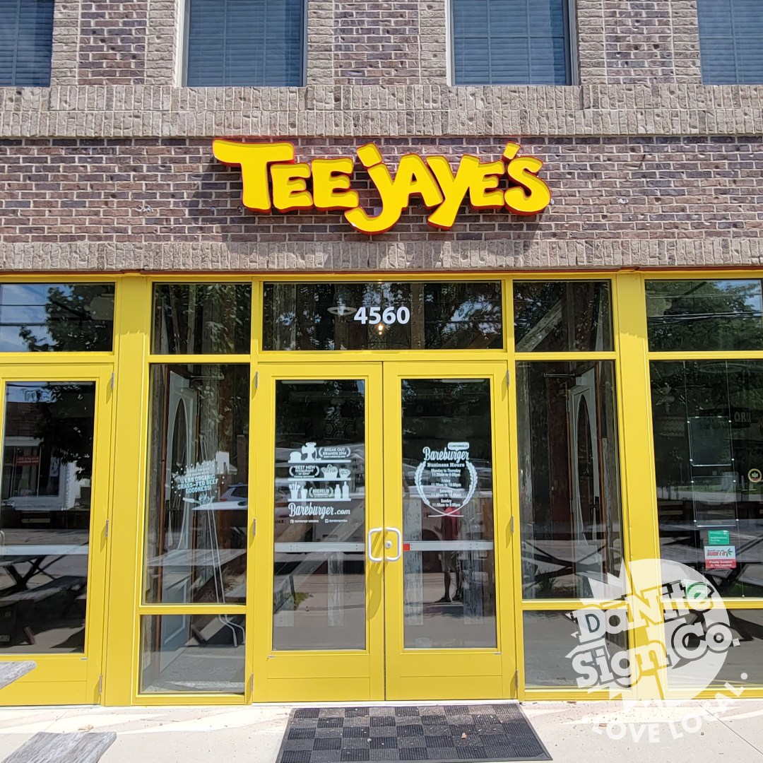
Yellow is typically considered a cheerful color that feels positive and optimistic (think smiley faces and the warm sun). This can be a great color to use when you want your branding (and customers) to feel happy. However, yellow can also be associated with fear (for example, many traffic warning signs are yellow), so be sure to consider that when choosing the color yellow.
Green
The color green is linked to nature as well as health, growth, and prosperity. It can create a sense of balance and help people feel relaxed. Green can be a smart color to choose if you want your sign to promote a sense of well-being. However, it’s important to note than green can sometimes be associate with boredom and stagnation, which is important to consider when choosing colors for your signage.
Blue
Blue encourages feelings of calmness, trust, security, and reliability. It can be a smart option for companies that want customers to see them as dependable and professional. However, blue can sometimes feel cold or unfriendly, so be sure to use this color wisely.
Purple
Purple is often associated with royalty, luxury, and sophistication. This color can be a great option for brands that want to communicate premium products or superior services, or that want to communicate a sense of elegance and exclusivity. However, be intentional when using purple, as it can also represent moodiness.
Black
The color black is often tied to elegance, sophistication, and power. It can give your branding a sleek and timeless look, making black a popular color for luxury companies. However, the color black can also feel cold and is sometimes associate with death, so be sure to take all associations into consideration when creating a design for your sign.
Tips for Using Color and Psychology in Business Signage Design

There’s lots to consider when choosing colors for your signage. In addition to understanding color psychology, it’s important to pay attention to your sign’s readability, visual appeal, and consistency with other marketing materials. Keeping these in mind will help you create signs that align with your brand, are memorable to your customers, and elicit the desired emotions and actions.
Tip #1: Focus on Contrast and Readability
The customer should be able to easily read and understand your sign. When creating the design for your signage, be sure to use colors that make the text and/or graphics stand out from the background. You can achieve this by using high-contrast colors. For example, you could try black or red lettering on a white background, yellow or white lettering on a dark blue background, and similar combinations of light and dark colors. Be sure to also use a font that is easy to read. Contrast and readability help signs effectively convey messages.
Tip #2: Use Visually Appealing Color Combinations
In addition to using color combinations that make your signs easy to read, it’s also important to use colors that look nice together. Doing so can elevate the overall look and feel of your signage, making it more appealing to the customer. Consider using color palettes with complementary colors or analogous colors, which tend to look good together. Try experimenting with different color combinations until you find the one you like best.
Tip #3: Keep Colors and Graphics Consistent Across Marketing Materials
When creating the design for a new sign, it’s important to consider the colors, graphics, and other design elements you use in your communication materials or existing signage. Keeping your signs in line with these materials contributes to a cohesive look and feel, reinforces brand recognition, and builds trust with consumers.
When your business is in the process of creating new signage, it’s crucial to consider the psychology behind color. This can help you design signs that stand out, convey a specific feeling or personality, and encourage desired reactions from your target audience. If you need an experienced sign company, contact DāNite Sign Co. We have decades of experience and can assist you by designing, building, and installing the perfect sign for your business.